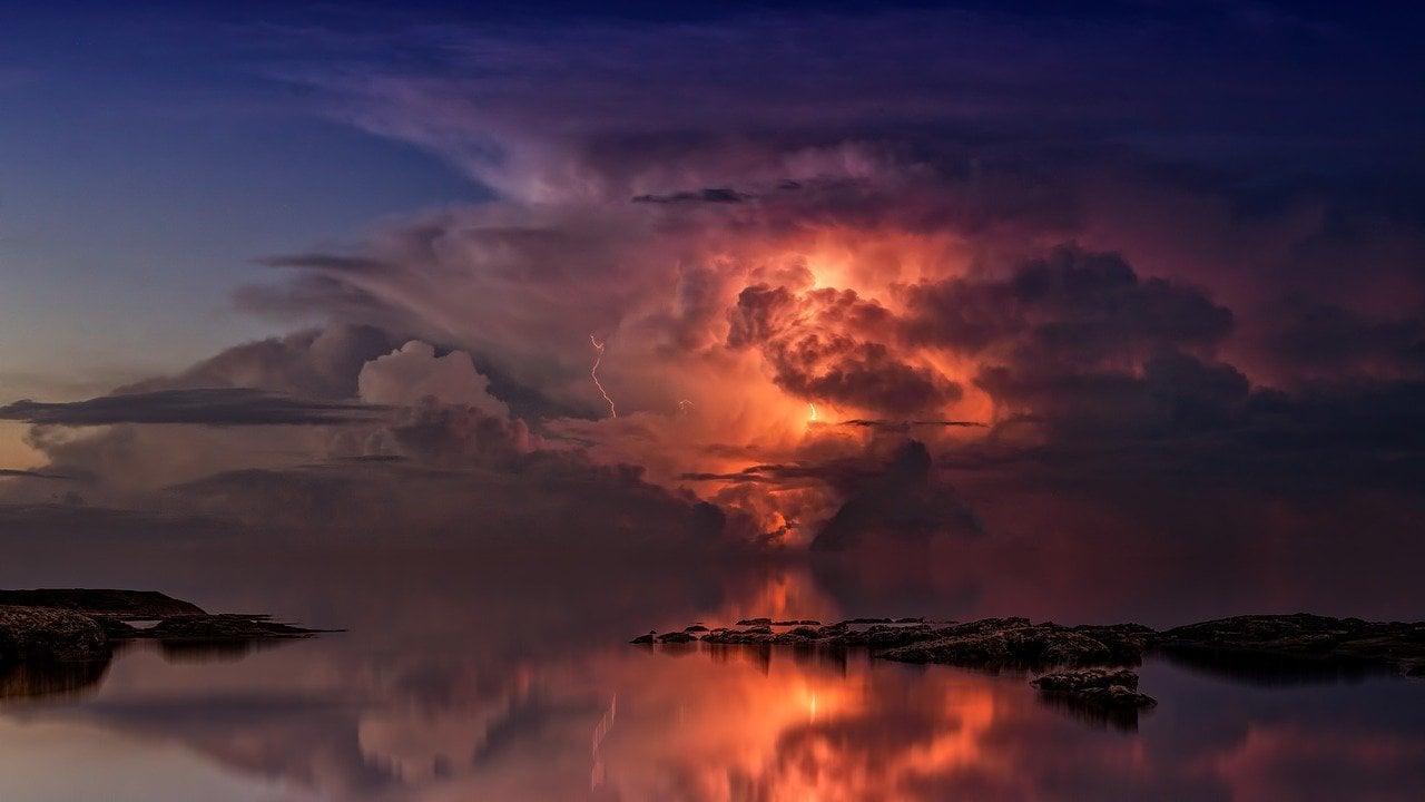

Choosing the Perfect Background for your Text
When you have a poem, quote or text that you want written in calligraphy we can make it into an unforgettable piece of art that will delight you every time you pass by and see it! My job is to create a memorable piece of artwork for you. Even if we are using your own photographs or selfies, I always add another background that fits perfectly with your photos.

The way to find a perfect background image is to read your text, and consider the meaning or pull out images from the poem and look for a great background to use with your words. That way, the poem speaks visually and through reading it at the same time. Every time someone passes by the picture, they'll think about that poem!
Calligraphy and Parchment "Paper"
Many people think of calligraphy and parchment as inseparable. But what if you could have a gorgeous background image to go along with your text? That way you have artwork that you love to see and read! That's why I try so hard to have people choose a background that goes with their words. And from the comments I get after the calligraphy is delivered, they are happy they made that choice!
What is a Perfect Background for Calligraphy
The Perfect Background for your calligraphy piece is a complicated choice. That's because you have a few considerations:
- The shape of the calligraphy text (is it vertical or horizontal)
- Is there a place on the image where I can place the calligraphy so it will be visible?
If the photo is "busy" with details, the words won't stand out from the background. - What does your gift recipient prefer- THEIR taste (don't consider YOUR preference if you are giving this as a gift!)

A busy background makes it hard to read calligraphy
Adding Your Own Photography to Calligraphy
Choosing the perfect background for your handwritten calligraphy makes your finished custom calligraphy text even more appealing because there's also a beautiful background. This is the only site online that I've found where you can add the artwork of your choice, including your own photographs to the handwritten calligraphy to create a one of a kind personalized gift! Check out all of the ideas that you've probably never even thought about!
If you have a photo you'd like to use, here's how to send it to me in full size. which is necessary for printing.
PLEASE, Not Parchment Again!
Think about it. I bet you’ve never seen an advertisement that is just text on a parchment or plain color background! And those artists make tons of money for their exciting and memorable designs. The things that attracts you to a particular book is the ARTWORK on the cover. Yes, you do pick a book by its cover!
If you have looked around my site, you’ll notice that 99% of my pieces have some decorative background- it can be a personal photograph, or the perfect background that graphically reflects your text. I STRONGLY encourage you to stretch out of your comfort zone and not choose a “parchment” or plain background. Art combined with your custom calligraphy text will really make it special and unique and add to your enjoyment of the piece every time you look at it!
A Cream Colored Background Behind Calligraphy Looks Unfinished
I always feel like an image enhances and elevates a quote. It also makes it more memorable because you have that visual that reflects the meaning you imagine in the text- the reason it's meaningful to you! It captures your attention when you walk past it. It creates a visual memory that goes with the words.
Think about it. I bet you’ve never seen an advertisement that is just text on a parchment or plain color background. And those artists make tons of money for their exciting and motivating designs!
What's Your Favorite Place?
The background doesn't even have to be prominent- a sky in the background, rainbow, ocean, forest, mountain? What moves you? Wouldn't it be nice to always see that background along with your custom calligraphy?


Life begins at the end of your comfort zone - Neale Donald Walsch
How To Find The Perfect Photograph or Image for Calligraphy
Close your eyes and think about your text. What do you see in “your mind’s eye”?

I may be ruining your ability to read by telling you this, but here goes: when you read anything you are running a silent video with pictures and images in your head. You’re probably not aware of it, but we think in pictures. All you have to do it pay attention to what you’re “seeing” in your head to get a great idea for a background image for your calligraphy text!
Calligraphy Text Determines Your Background
How to choose the right background image for your calligraphy depends on many factors. It's a different kind of art than others because you need to fit the "shape" of your text into a background. So just finding a pretty background is probably not always going to work! You need to look at your text and see, not the words, but the shape of the words. I know, it's confusing! But I'm here to help you.

Where to Find Great Photographs and Images
There are many sites where you can find copyright stock photographs to use with your calligraphy quote. (I will include one photo with the price of your calligraphy services).
Make sure to enter search terms or keywords in order to limit the hundreds of photos that will appear. The best place is Adobe with wonderful photos with TONS of choices.
You can also limit the choices by following this directions to make it easy. Click here to learn how to Use filters that will only show you photos in a particular direction or style or even color! I don't want you to waste your time. And in fact, you will probably really enjoy looking at all of the wonderful photos and images. I had a customer tell me what fun she had traveling through all of the photos before she found the perfect image for her calligraphy quote.
Make SURE to save the pictures you like in a “lightbox” or save the ID numbers and send them to me. Also when you see the image make sure there’s a place in the photo where I can place the calligraphy. Keep reading below so you won't make a mistake picking the wrong kind of image.
NOTE: PLEASE DO NOT find a picture on "Dr. Google" images.
First of all, it is probably too small a resolution for printing.
Secondly, it may be copyright protected and it wouldn't be ethical to "borrow it" for your use without paying the artist.
See below for great places to find wonderful images: photographs, artwork, etc. that will be perfect for your calligraphy text.
Searching for Online Images-
Of course you see thousands of images when you do a search online. But the resolution of these images is generally very small and only meant to view on a computer, or small monitor or even phone.
Furthermore, many of them are copyright protected. They are not available to use for your background image
unless you pay the artist or photographer.
The size for a sharp print is 300 dpi- That's the size of Adobe photos and images.
Otherwise, you are wasting your effort picking an image that won't be able to be used with your calligraphy text.
The Size of Calligraphy
It's also important to figure out the approximate size that you prefer. Are you going to hang the calligraphy on the wall centered over a large object (such as your couch or bed) or put it on a bookshelf? You want to have balance, so you don't have a custom piece of calligraphy art the size of computer paper centered over your couch! It would be lost!
Another good way to figure out what the final size should be is to take some tape and put it up on the wall where you want to hang your calligraphy poem or text. Or you can also cut up some cardboard to approximate the size that you like. That gives you a feel for what it will look like.
The Shape of Your Calligraphy Text Determines How To Choose the Perfect Background

Your text has a shape that's determined by how long each line is, (that's the width) and how many lines of writing there are (that's how tall it will be).
If you have a poem with specific line breaks and number of lines, your text will decide the best final dimensions of your final piece of artwork.
The width of the finished piece depends upon how many words are on each line. The height depends upon how long (how many lines or paragraphs) are in the text.
It's important to leave borders around the writing in the artwork, and they generally should be equal on both sides, top and bottom. So now you see that calligraphy has to find it's own size. I can shrink the size of the entire piece, but it must keep its proportions, or the calligraphy will be either stretched or compressed!
You may think: make it larger- but when the size of the letters are bigger, they get wider as well.
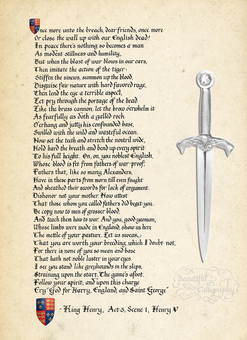
Even if you have a plain background such as "parchment" you see from the example above that the piece looks empty and unbalanced because there's too much space on the sides!
Standard Size for Framing
There are certain sizes that are standard for framing. If you are going to have your piece professionally framed you don't need a stand size frame. Check out the terrific options I have at Beautiful Calligraphy for different styles of framing) But you still want balance of borders in the calligraphy and background.
If you have a more "free style" text where line breaks are not important, such as a personal letter, you still want to take into account "orphan" words. I never like leaving one or two words on a line by themselves. While it's easy to do this with a computer and adjust the size of the font, it's not the same with writing hand calligraphy! I have to set up each line manually. It's hard to read very long lines of text. Your eye actually gets tired. So I work to keep the maximum number of words per line to about 14-16 words.
In fact, you probably do this automatically when you are reading text on the computer. You can make the window larger or smaller and that adjusts both the size of the font and how many words are on a line.
I know, it's a bit confusing. I'm sure if someone was great at math they'd be able to figure out a way to do it. But I'm just a creative type and I have to "see" what the line looks like. AND, I have to figure out where to break lines so it makes sense.
Balance The Look of Calligraphy With Decoration
I make sure that your calligraphy looks beautiful with using decoration to balance the sides. This poem was long and narrow. This is a poem written by the famous author Charlies Baudelaire entitled "Always Be Drunk". Luckily I found the perfect picture which was also long and narrow of someone pouring from a wine bottle and missing the glass. I guess the drinker already had enough wine in them while pouring!
You can see how that balanced the shape of the calligraphy and elevated the look of the calligraphy to make it look really great! This is one of my favorite calligraphy pieces.



Don't Buy A Frame Before Your Calligraphy is Completed
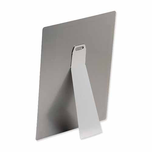
I have great news for you. Beautiful Calligraphy (that's me) can have your calligraphy arrive ready to hang on the wall, or sit on a flat surface (desk, etc.) right out of the box. No need to find a "standard size" and make a trip to the framer. In fact, oftentimes framing costs MORE than the custom calligraphy I've done for you! And these types of prints are available on so many surfaces! Canvas, metal, wood, acrylic, and a lot more! Check them out here.
Even if you want to go the traditional route with a frame ad glass, it's best practice not to buy a frame before you have your custom hand calligraphy finished. The colors on your mat may be different from what you expect and may clash. And making the calligraphy fit a frame can end up with an unbalanced finished size of what the calligraphy should be. It will be just like trying to fit Cinderella's shoe on a large foot!
Check out the great alternatives to framing that come ready to hang. They have a fresh new look. You can see below for examples and read more about the options.
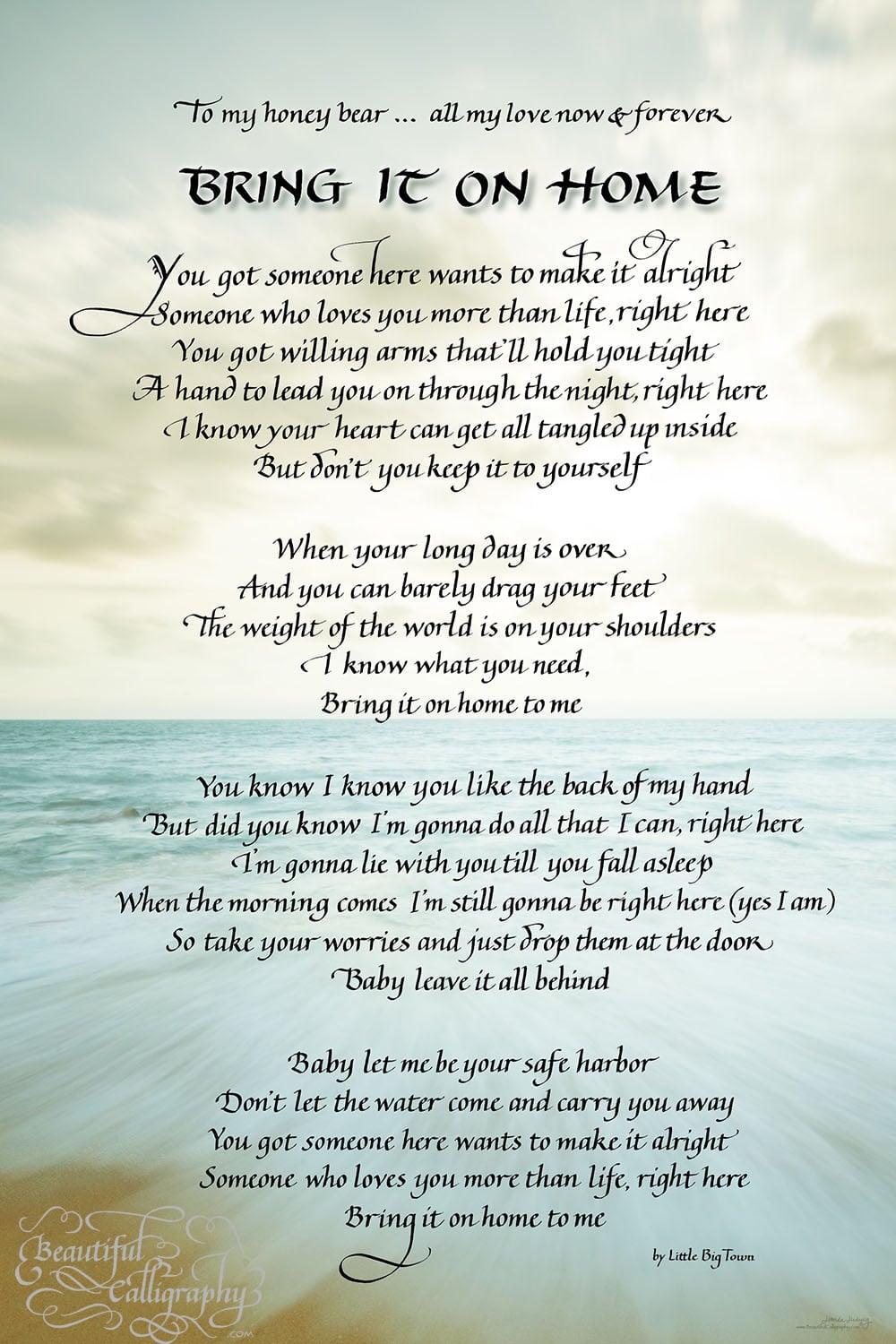
Below are examples of calligraphy lettering artwork that were improved by adding some decorative element on either one side or both. You may just want "dark writing on parchment paper" but it won't look good when you see it if the text is not wide enough to fit a pre-determined space. I know it's confusing, but I hope I've explained it so you understand. If you have questions, just write and we'll come up with the combination of the perfect size and decoration for your needs.
Finding the perfect photograph for your calligraphy gift
You may find lots of pictures you love, but it still may not work with the calligraphy. You may love a particular photo but you have to consider how it will work with the calligraphy text. Here’s the thing I look for- where am I going to be able to put the text?
A photo like the one below has that dark rock right in the middle- and I’d have to write on right side- but it would look unbalanced.


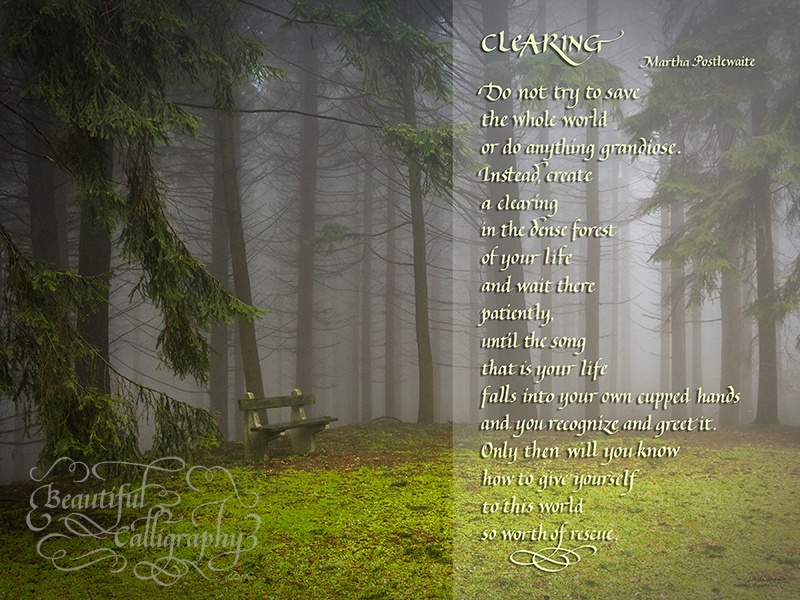
This is the kind of image you want- where's there's room for the calligraphy text.
A Perfect Background Has A Place For Calligraphy
One of the reasons the photo above is perfect is there’s not a lot of contrast with dark vs. light in the area where the text will be- so the calligraphy is clear and legible from top to bottom.
That would be the problem with the photo below- light on the top (great for black writing), but dark on the bottom, and harder to see the black writing… So what color can the text be that will stand out in both sections? RED? You probably don't want that!
Photograph With No Space for Calligraphy can only be boxed
I know how great it looks when the entire photo is used as the background and the calligraphy is superimposed right on the picture. But it can't always be done.
Oftentimes a photograph you want to use cannot be used for an entire background, but can be part of the calligraphy design. I can't write over the photo or you won't see the people in the photo or an important part of the picture! If you look the beautiful wedding photograph of the young and old couple below, you’ll see that there’s no place for calligraphy to fit on that photograph. It's the same thing with the picture of the hands of the mother and daughter In that case, a parchment paper background, or a color background can pull the calligraphy art piece “together”.
I some cases I can use Photoshop to edit the picture and use it. But that takes a lot more time, and therefore it costs additional than when I just have the perfect photo to begin with. Read more below..
Creating More Background With Photoshop
Photographers Don't Leave Background for Calligraphy
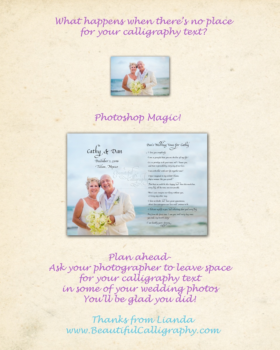
Sometimes I have to use photoshop “magic” to extend the beach or a background. You can see that in the original little photograph example, the couple was centered on the with the ocean background. I had to move the couple to the side and extend the beach on one side to superimpose the caligraphy text. And it’s not even possible. It takes me extra time to do that, and ends up costing you more.
If you are planning on using your wedding photo for calligraphy make sure to speak to your photographer ahead of time and tell him or her not to center all of the photos and leave space for calligraphy.
Background Image Behind Your Photographs
When I box your photograph and write your text in calligraphy on the side it's important to have some kind of very subtle background that unites the photo and the text. Otherwise the calligraphy piece will look unfinished.

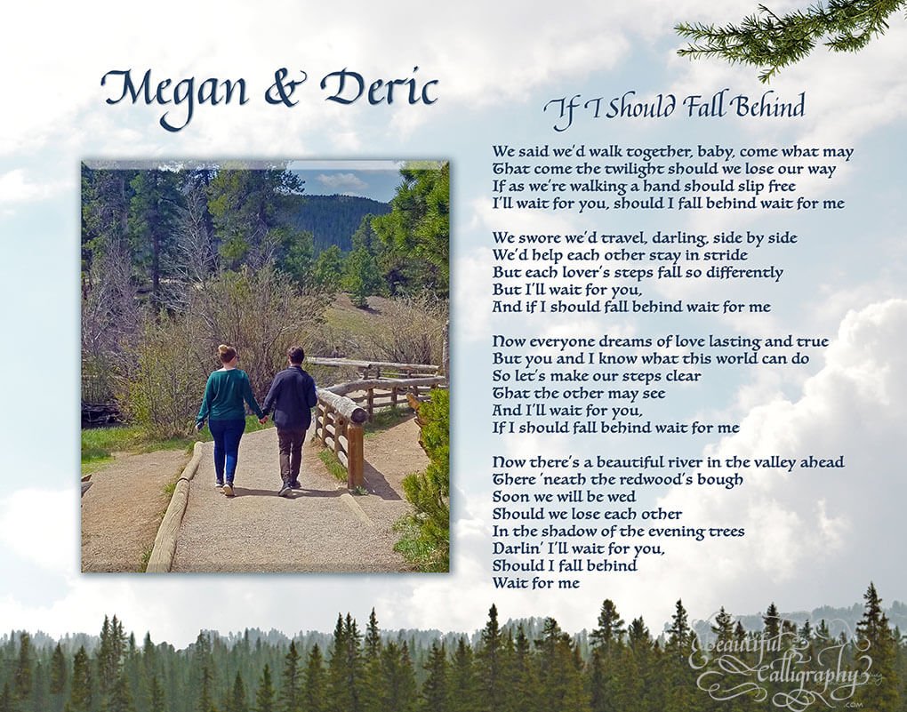
I like using a variety of background images that depend on your style. A sky can be a subtle background that goes with nearly any type of decorating style you have in your home.
Other Background Images for Behind Your Photo
Here are some examples of backgrounds for you to choose from. These are just for some ideas. You can look on Pixabay.com for other free background images by putting in keywords for the type of background you'd like.
Or Adobe has gorgeous backgrounds, but there is a small extra charge to purchase them.


How To Take A Great Photograph
If you are going to take a picture to include in your calligraphy order, I have written a blog about 7 tips to make sure your picture comes out great.
If you’re taking a digital photograph of another paper photograph, it’s particularly difficult to get it in great focus. If you have a printer/scanner that would probably give you the best results. Set the scanner to 300 dpi to get the sharpest results for printing.
And if you’re going to take a picture make sure to take a bunch of them so you can choose the best one! Even professional photographers take multiples of any shot – just to make sure they get the results they want. And since we don’t use film any more, it’s practically free to take thousands of photographs!
Now you know how to pick the perfect background image for your calligraphy! Believe me, you will be happy you put in this effort when you see the final result. Just contact me to get started with an inquiry.
and remember..
Alternatives toTraditional Framing
Framing your calligraphy poem or text takes time and additional money. Sure there are standard size frames. There are times when your finished calligraphy on paper doesn't come out to a standard size. And the choices for ready-made framing are generally not so great.
In fact, my customers used to complain that the frame cost more than the artwork! Glass over framed calligraphy can change your ability to read because of the reflection. The option is non-glare glass with your frame. The non-glare glass is absolutely invisible is even more expensive than regular glass! If you do traditional framing over paper, you will need to protect your calligraphy artwork (except oil and acrylic paintings) with glass. That's not necessary anymore!
At Beautiful Calligraphy, I have many options so that you won't have to go shopping and spend a fortune on traditional framing for your calligraphy poem and artwork.
Framing With Glass
One of the things that I love so much about the metal, wood, canvas and other wraps is that you are not separated from the artwork with glass. There's no distortion or reflection with many of the surfaces - unless you choose to have it glossy and reflective (like acrylic). But that even has its charm because you see the artwork through the sides!
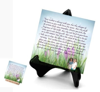
Some of the many different framing options are below, and there are even more! You may surprise yourself and find something that you will really treasure! AND if you have a smaller piece you can also get a tabletop version with a built in stand! Now curved metal that stand on their own are available as well. Perfect for your fireplace mantle or desktop.

S T R E T C H out of your comfort zone and you will surprise yourself with something you love!
