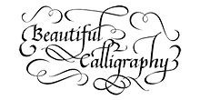
How Can You Tell If It’s Quality Calligraphy? ~
When you are going to hire a calligrapher and spend your hard earned money, you want to make sure that you are going to be ordering quality calligraphy. And although calligraphy is defined as the art of beautiful writing, there’s a subjective determination about what makes a quality piece. The difference between other art forms and calligraphy however, is that there are rules about how to construct the letter forms.
Yes, in calligraphers artistic talent does play a part, but one must first know the rules before breaking or bending them! Quality calligraphy can be determined in great part, by knowing what the letters are supposed to look like, and finding consistency in their form, size, slant, serifs and other characteristics. But when you know the rules, it's also OK to add variations of letter forms that are done artistically, and not over the top!
Importance of a Knowledgeable Calligraphy Teacher
Back when I took my first calligraphy class in 1979, I had no idea what quality calligraphy looked like. But I grew up in New York and didn’t realize how lucky and privileged I was to have so many of the greatest calligraphers in the world available as teachers, and friends. They taught me to know what to look for in a piece of quality calligraphy – something done by a great calligrapher.
I learned many historical “hands”. That’s what a style of calligraphy is called: not a font.
Calligraphy is Not Squiggly
Back then, with my unstudied eye, anything with “flourishes” (fancy swirls on the letters) qualified as calligraphy to me – and I wanted to learn how to do it. In the early stages of my studies, I remember receiving compliments for my work from people impressed by flourishes. But as I studied calligraphy in depth, I learned to distinguish professional quality calligraphy from fancy lettering. In fact, I have found that much of the calligraphy for sale is of a substandard level that would not be considered professional quality. As with everything else in life, it is “buyer beware”. That is why I am writing this section: to help you to become a discerning and educated customer, who pays for, and receives a quality product.
Look for Consistency to determine quality
Proper calligraphy letters have CONSISTENCY. For example, each “A” looks like every other “A”. It has the same width, height, shape, thick and thin parts, slant, serif shape (the beginning and endings of letters), and spacing between letters, as each other letter. Furthermore, each “a” is also the same width as every other letter in the alphabet, except for “m” and “w”. Interestingly, I learned that with this type of consistency one could construct of an entire alphabet with only the letter “a” or “n” as a guide to what the other letter should look like.

Breaking the Rules with Inconsistency
Calligraphy is done by hand and not a computer. And when you're paying for calligraphy you don't want it to look like a computer font. That's where artistic inconsistency comes into play.
I will frequently insert a variation of a letter in text. Flourishes are not all the same on the same letters. Your eye gets "bored" when looking at long lines of text that are all the same.
Calligraphy that is in “style” right now
Recently a new type of “calligraphy” lettering became the rage. This style is called modern calligraphy. It’s a newly developed style that many people are learning on the internet, but not doing very well. In that people like it and are using it mostly for weddings. But it really breaks most of the “rules” of what makes lettering considered to be calligraphy, like in the exemplar above. It’s “bouncy”, there is no consistency in the sizes or the shapes of the letters. It’s more like a fancy handwriting with thick and thin parts of the letters.

Well done calligraphy reminds me of a beautiful, softly curling ribbon. It has “organic” connections- no hard spikey connections between letters. To achieve this look and feel on envelopes, calligraphic lettering, in general, should be opaque coloring. Unfortunately, it’s hard to create beautiful “hairlines” (the thin parts of letter) with waterproof inks, and therefore, when working with color, I mix paint to match whatever color scheme you choose. One of the things that makes calligraphy beautiful is the contrast of the thick and thin parts of each letter, which can generally be accomplished when the paint is not waterproof.
My Guarantee
All of my work is fully guaranteed, no worries! If you are unhappy with the job, I will either correct the problem, or refund your money. Ordering quality calligraphy for a special gift, or for yourself is just click away.
