Don't Get Cheated Paying for Inferior Hand Calligraphy! ~
What is good calligraphy that is well written and designed? ~ How do you know if you are getting good calligraphy when you hire a calligrapher?
Calligraphy is an art; but there are ways to tell if it's well done. Anyone can call themselves a professional calligrapher; and anyone can have years of experience. But if you practice doing hand lettering the wrong way for lots of years, all you have is an experienced poor example of lettering!
Fancy Writing
Sure, you might want to look at Yelp to see reviews. But honestly, I have seen reviews that say the calligraphy is beautiful, and then see the calligraphy they paid for. All I can say is ugh! It really makes me sad because of the level of calligraphy lettering that is not up to a decent standard of expertise.
I feel bad putting down another person's work, but really I feel it is my duty to educate you! You should NOT pay good money to have your envelopes addressed by someone using a felt tip pen, or a cartridge pen! You don't get professional results with either of those tools! Ask the calligrapher if they use a "Dip Pen". If they say no, find another calligrapher!
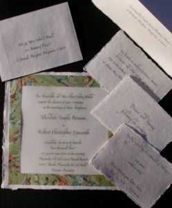
Calligraphy Poem and Text
Although I rarely address envelopes, the same rules for addressing envelopes should be the way you form beautiful letters when writing a calligraphy poem or any text! So here goes:
What should you look for in skilled, professional calligraphy?
1. Thick and thin parts of the letters.
Calligraphy tools are meant to form letters that have thick parts and thin "hairlines". It's done either with pressure on a nib (not possible with a cartridge pen or felt tip), or by holding the square cut nib in a consist angle.
2. Consistency in the shape, width, and form of the letters.
This can present some difficulty, because as I said, if you practice the wrong form for years, you will have consistency. But in my opinion, it's consistently wrong and unattractive when you compare it to well done calligraphy letters, spacing and design!
3. LEGIBILITY! You need to be able to read what was written, no matter what style of calligraphy you choose! These examples show you that it's hard to read what was written by a so-called professional calligrapher!

Examples of Poor Calligraphy
The person who did this got really positive review in Yelp! It looks like it was done with a felt tip pen. The letter forms have thick or thins parts of the letters but there is no consistency. The connections between the letters look like a stick that was stuck into the next letter. And most of all calligraphy is made up of words and you MUST be able to read what it says!
Yes, calligraphy is described as the "art of beautiful writing", and anyone can have an opinion. But PLEASE get some comparisons to make sure you are getting quality handwritten calligraphy when you are paying good money for your wedding calligraphy, or any other calligraphy service! Look for a professional calligrapher's lettering before you order.
Beautiful Handwriting
The definition of calligraphy is “beautiful writing” and your opinion is what makes something beautiful, although it’s not an actual calligraphic style. Beauty is in the eye of the beholder, which means everyone has their own opinion.
Modern Calligraphy
The popular style right now of wedding calligraphy is called "modern calligraphy". The examples are above. You can examples above is a handwriting that doesn’t follow any of the rules. The calligraphy letters don’t stay on a line, they’re “bouncy” and very inconsistent from one letter to another. You can even see the places in the letters where the writer hesitated.
Although this is a style, there are people who can do it well, but not in these examples. In my opinion, it looks ugly, and certainly not like professional calligraphy. In most other legitimate styles of calligraphy, capital letters are the same size, or shorter than the tall parts of letters called “ascenders” (in b, d, k, l, h). In many cases you’ll see it’s pretty illegible or difficult to read. I can’t imagine that the mail service is going to have an easy time reading the address on the envelopes! A professional calligrapher knows that you must be able to read what is written above all!
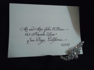
Here's an example of an invitation that is done in my calligraphy. I first wrote the calligraphy, edited it with photoshop, and then sized it for the different size pieces. It was sent to a printer, and printed in the color the bride chose. This can be done on any invitation that you like- instead of using a computer font, you can have a custom invitation done with calligraphy. Then I can address the envelopes for you, so it will be a totally custom invitation.
Don't settle for second best! You deserve the best!
Calligraphy Font is called a Hand
In calligraphy terms, the style of writing is called a "hand". In computer language the style of text is called a font. But in either case, consistency of that style is what shows the skill of the scribe or calligrapher. (not a calligraphist)
As I said above, the consistency is not the bottom line, because you can consistently be doing calligraphy that does not have the characteristics of excellence in letter forms!
Here's an example of what Italic Calligraphy letter forms SHOULD look like. It's not easy!

There also needs to be space between lines. The tops of tall letters like "L" "h" and others should bump into the lines above them. The letters that have "descenders" like "j" "g" etc. should bump into the lines below them.
Learn about good calligraphy by studying the masters! John Stevens is a world accepted authority and one of my favorites.
I Will Help You Determine Good Calligraphy
If you are unsure about the level of calligraphy that you are considering you can write to me and send an example. I'll be happy to critique it fairly and give you my opinion.