Styles of Calligraphy (known as “Hands”) ~
In calligraphy, styles of writing are known as “Hands”. On computer a kind of the typeface is known as a “font”. Mistakenly people refer to styles of calligraphy as “fonts”.
So many people have computers and are aware of the many choices of fonts you can use to write text and enjoy picking different fonts to write letters or emails.
There are many different styles or hands of calligraphy that come throughout history. One common mistake is referring to “Old English”.
“Old English” Style is Actually Black Letter
When you see the writing heading of the New York Times, most people think that’s “Old English”. The capital letters are very fancy with thin “hairlines” running through the letters and all sorts of decorations.
Before paper was invented you had to write on something! The obvious choice was something that would last and could accept ink or paint. Animals skin was used. That’s actually what parchment is!
Because getting parchment ready for writing was so time consuming you couldn’t waste the skin with a lot of blank space. So a lot of words had to be compressed onto one animal skin. The result is a page that looks very black because the letters were squished together.
Even when I don’t write an entire text with Black Letter style (Old English) I like to use a leading letter written written in the style. It will be a larger letter, and often it’s decorated or boxed with gold behind it. That makes it stand out and look beautiful.
But if the style of the calligraphy is more contemporary I like to use a modern looking leading letter with color that’s in the piece.
Questions and Answers
My customers sometimes have questions that I answer via email. But I thought you might be interested in this Q & A.
Q: I would love to understand what we are looking at…ie, at what stage did you do your calligraphy, the “book” looks like it has been “painted” on the edges…and the surface is smooth and flat as though it is a print. I am not sure how to ask the questions, but just interested in the steps to get to the final product. Thanks again!
 A: Yes, your calligraphy was printed by a high resolution giclee printer. That’s why it looks like an original, not a print. The print can be done on different surfaces with finishes that look like linen, canvas, watercolor paper, etc.
Q: The writing looks so perfect. Is it a computer font?
My calligraphy is handwritten, unless you choose a computer font. I always start by doing the calligraphy by hand first. I write it on white paper with black paint (not ink!) at a larger size then I need so I can reduce it to the proper size. You can’t enlarge lettering because the edges get blurry as you go bigger. So I always work larger. It takes a lot of paper. I’m working 9 x 12. Then I scan it into my computer at a high resolution, and import it into Photoshop. I arrange the text, fix any mistakes, bad lettering, adjust the spacing for each line (how much space between). Sometimes I have to center the text, sometimes flush left, or even following a design as you see in this example.
Calligraphy Styles or Fonts
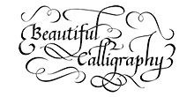
The other side of the book is flourished italic. When you don’t have too much text, I can put wide spacing between the lines and have space to put in flourishing that doesn’t make it hard to read.

Whatever style of calligraphy or font you prefer, well designed calligraphy can come up with a solution. My calligraphy services are not just writing out text, but coming up with the perfect design, layout and printing (framing) of your calligraphy poem or text for any occasion. Click on any photo to get started on YOUR calligraphy piece.

