Modern Calligraphy ~
"Modern calligraphy" is all the rage now. Well, I guess you can call some of it calligraphy, because the definition of calligraphy is "beautiful handwriting". But this just looks like messy handwriting to me. And it's hard to read. (and she didn't even have fresh nail polish!- LOL)
OK, I admit I'm a calligraphy snob. I've studied calligraphy with some of the "greats" over the past 40 years (OMG, I sound OLD- yes, I am probably older than you!). Even very talented artists have to learn how to create calligraphy letters. That makes calligraphy different from other types of artwork- there are "rules" to create good letter forms.
But the best "modern calligraphy" I've seen follows rules- just like historical hands.

How To Write Modern Calligraphy
It's done with a pointed pen that's used for copperplate calligraphy. A pointed pen creates thick parts of the letters from pressure when you are pulling them pen downwards. The thin parts of letters come from pushing away and are called "hairlines" because they are supposed to be very thin. The pen that you're seeing is actually made for a right handed person. It's easier for a "lefty" to write copperplate and they don't need a special pen. Their hand is naturally in the position to create that sharp slant to the right.
Poor Examples of Modern Calligraphy
Modern calligraphy should have thick and thin parts of the letters, just like copperplate. Otherwise why would a person doing this style use this type of pointed pen? And btw, using this point is VERY difficult and takes years of practice to use well. It is so easy to catch a fiber of the paper and make a big splatter when pushing upwards on the copperplate pen!

Envelopes Written in Modern Calligraphy
The modern style is used for envelopes for wedding invitations. But when you try to read the address it makes you wonder if the invitation will even get delivered! Most of the people who write this type of lettering are self-taught and just write bouncy letters some larger and some smaller. Letters have no consistency and the worst thing of all is that it is hard to read! If your guest doesn't reply you better ask if they ever received the invitation!
Poorly Done Modern Calligraphy Examples
In all calligraphy including historical hands, the flow of the letters should be "organic" connections. I learned from some of the most well-known and talented, skilled calligraphers. They made it a point to teach this matter. It's important for letters to flow into one another. You should not have any lines that stick into another part of the letter. Let me show you examples so you'll know how to tell if the calligraphy is well done.
Some Modern Calligraphy is Attractive
There are some people who actually write calligraphy that is legible and attractive. But you should ask to see samples first. Don't ask for testimonials because it could be their sister who is saying their work is wonderful.
When I first started studying calligraphy I thought that swirls (called flourishes) was what calligraphy was supposed to look like. But I realized that moderation and legibility is the most important thing when you want someone to be able to read what you've written in calligraphy!
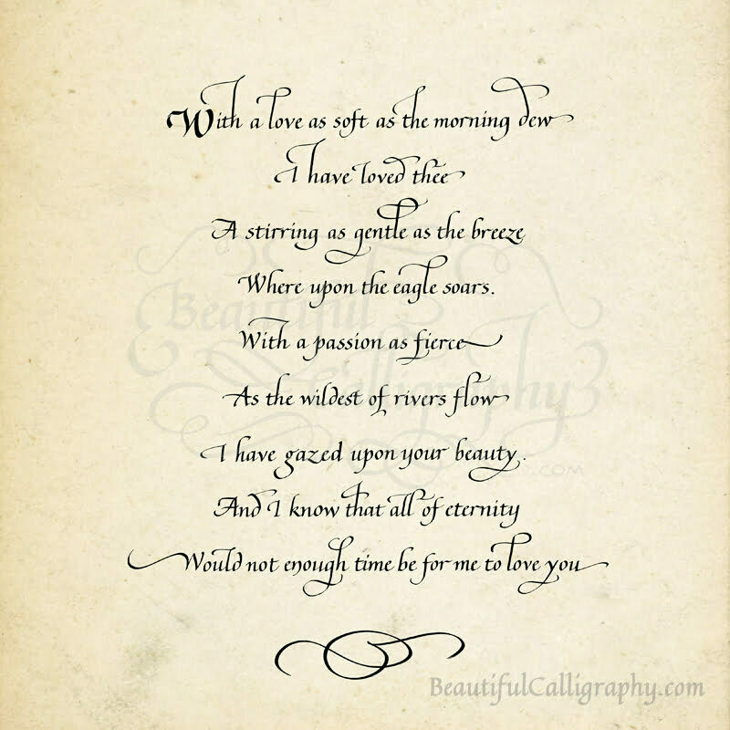
Here's an example I wrote of flourished italic calligraphy that was both legible and beautiful. What do you think?


